Fluid Sections
Drag-and-drop layouts with free absolute positioning — place, resize, nest, and style widgets without writing code. Ideal when you need overlapping creative compositions that a grid cannot express.
Overview
Fluid Sections are Matrix widgets with drag-and-drop placement and resizing. Change background color, swap images, adjust border radius, nest widgets, and more — all from visual popups, without coding.
-
Absolute positioning for freeform, overlapping layouts
-
Heading, Text, Image, Button, and Mask Pattern widgets
-
Nested elements constrained inside a parent widget
-
Mobile stacking with optional Mobile Order controls
-
Section settings for height, full width, radius, and spacing
When to use Fluid vs Page Builder
Choose Fluid Sections when you need free placement and overlapping elements. Choose Page Builder for structured columns, modern widgets, and ongoing feature development.
1 Quick setup
Enable Fluid Sections in Edit Head and upload the matching JS chunk from your Updates package.
window.MatrixConfig = {
  features: {
    fluidModule: true  // Enable Fluid Sections
  }
};-
Upload
fluid-module.matrix.js(and keep vendor chunks from the same build) -
Save Head, hard-refresh the Jimdo editor
-
Look for Fluid Section in the Jimdo
+module map
2 Add a Fluid Section
Open the module map
In the Jimdo editor, click the + button to add a module on the main content area.
Choose Fluid Section
Select Fluid Section from the map. Matrix injects an empty fluid canvas into a text module.
Add your first widget
Click the centered plus button and pick Heading, Text, Image, Button, or Mask Pattern.
Position and style
Drag to place, resize from edges, and open the gear icons for element or section settings.
3 Widget types
| Widget | What you can do |
|---|---|
| Heading | H1–H3, color, font, size, weight, transform, letter-spacing, background, animations, visibility |
| Text | Rich text with TinyMCE, colors, font, weight, background + opacity |
| Image | URL / upload, alt text, resize with aspect ratio, background, animations |
| Button | Label, link, new tab, style (default / square / rounded / pill), colors |
| Mask Pattern | Decorative overlay (e.g. dots), absolute placement, background + opacity |
4 Drag, resize & edit
-
Drag — move widgets freely; they stay inside the fluid area (or parent when nested)
-
Resize — drag edges/corners; images keep aspect ratio
-
Stacking — overlapping widgets use z-index; bring elements forward via section stacking or drag order
-
Edit text — use the pen icon on heading / text / button content (orange border = edit mode)
-
Reset All — clears every widget and resets section defaults from the popup footer
5 Settings popups
Element settings (gear on a widget)
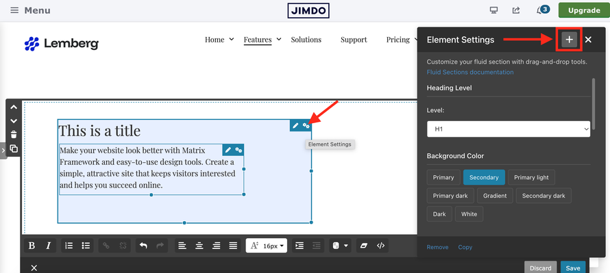
Background, opacity, custom class, animations, visibility — plus type-specific fields (image URL, button link, heading level, etc.). The + in the popup header adds a nested child widget.
Section settings (gear on the area)
| Setting | Description |
|---|---|
| Background | Tag colors or custom color + opacity |
| Border radius | 0–100px slider / input |
| Size | Contained or full width |
| Height | 100–2000px; widgets keep their visual size when the area grows |
| Mobile spacing | −50px to 100px gap between stacked items on mobile (default 20px) |
| Custom class | Space-separated classes on the section wrapper |
The + in the section popup header adds a new top-level widget (not nested).
6 Nested elements
Build hierarchical layouts where children stay inside a parent — for example a button overlaid on an image, or a badge inside a text card.
Open element settings
Click the settings gear on the parent widget.
Click the plus in the header
Switch to widget selection for a nested child.
Choose a widget
The new element is appended as a child with the is-nested-fluid class.
-
Nested widgets stay absolute and keep custom width on mobile (they do not force to 100%)
-
Drag containment is the parent element, not the whole canvas
-
Text overlays on images remain selectable while the photo itself is not dragged by accident
7 Mobile layout & order
On viewports ≤ 1023px, regular (non-nested) widgets switch from absolute placement to a stacked, full-width layout. Overlapping desktop compositions are intentionally simplified for readability and tap targets.
| Element type | On mobile |
|---|---|
| Regular widgets |
position: relative, full width, stacked with mobile spacing
|
| Nested widgets | Stay absolute; keep custom width |
| Mask patterns | Stay absolute with % width/height |
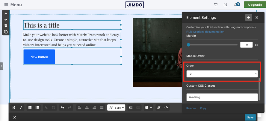
Mobile Order
Use Mobile Order in an element’s Settings popup to control the stack sequence on small screens when absolute desktop positions would otherwise produce a confusing order.
Troubleshooting
| Issue | Fix |
|---|---|
| Fluid Section missing from the map |
Confirm fluidModule: true, upload fluid-module.matrix.js from the same build, and add from the main module map (not inside columns).
|
| Cannot resize image after changing URL | Update to the latest fluid module from Updates — image URL sync was fixed in 2026 maintenance. Avoid mixing old Matrix Themes JS in the Style Editor. |
| Border radius / Rounded not saving on text | Re-upload the current fluid JS; rounded settings for text widgets were patched for Framework and Toolkit. |
| Widget under another after drag |
Use section Stacking / bring to front. Z-index applies on the .is-fluid widget (including when TinyMCE wraps the first block).
|
| Editor feels heavy |
Fluid loads jQuery UI only when enabled. Disable fluidModule on sites that use Page Builder exclusively.
|
If you have encountered any bugs, errors, or unexpected behavior in the Fluid Sections, please leave a comment below.
Support team (Saturday, 04 April 2026 12:41)
Hello Stefan,
Thank you very much for your detailed bug report — it is really appreciated �
1) Image resize issue
The image resizing problem occurred only in Matrix One, and it has now been fixed.
2) Rounded setting (text fields)
The border-radius issue for the text widget was present both in the Framework and the Toolkit as well, and this has also been resolved.
How to update
To apply the fixes, please:
- Download the latest fluid-section js file file from Update Sections
- Upload and replace the file on your website
Important note:
On your website I noticed that an old JavaScript file from Matrix Themes is still present inside the Style Editor. This file should be removed, as it may cause conflicts.
I also recommend running the Template Updates from the Style Editor to make sure all components are fully synchronized.
Stefan (Saturday, 04 April 2026 11:22)
The "Rounded" setting for text fields does nothing. You can set the slider to any value - it is not applied nor saved
Stefan (Saturday, 04 April 2026 11:17)
Image can not be resized after changing image url.
Steps to reproduce (occurred in Firefox)
- Create a new fluid section (leave all settings on default)
- add an image
- change the image url
- try to resize the image by clicking and holding the image border (resize dots). for me it is not working. only after adding the image (clicking on plus icon) and only if I did not change the image url I can initially resize the image.