Page Builder
Build structured, responsive layouts directly inside a Jimdo text module — sections, resizable columns, and toolbar-based widgets (Heading, Text, Image, Button, HTML, Divider/Spacer, and native Jimdo Module embeds). Style everything with backgrounds, borders, shadows, entrance animations, device visibility, and icons — all without touching code.
Overview
The Matrix Page Builder is a modern, jQuery-free page builder built for Jimdo — the core feature of Matrix Framework v1.5.0+. It gives you a professional, toolbar-based interface for creating structured layouts inside a single text module, without drag-and-drop fragility or any coding.
-
Flexible sections with unlimited resizable columns (1–8, custom ratios)
-
Eight toolbar-managed widgets: Heading, Text, Image, Button, HTML, Divider, Spacer, and Jimdo Module (embed a native Jimdo module)
-
Full backgrounds (color, gradient, image, image+overlay), borders, shadows and spacing
-
Scroll-triggered entrance animations and per-device visibility controls
-
Optional icons on Heading, Text and Button widgets, plus a Design Library of premade sections
-
Clean separation of admin and public code — the public page ships lightweight, restored CSS only
1 Getting started
Enable the feature in your Matrix configuration, then add a standalone Page Builder module from the Jimdo module map.
window.MatrixConfig = {
  features: {
    pageBuilder: true // Enable Page Builder
  }
};Upload the four bundles
page-builder-core.matrix.js, page-builder-widgets.matrix.js, page-builder-admin.matrix.js, and
page-builder-widgets-extra.matrix.js — and remove any old page-builder.matrix.js.
Open the module map
In the Jimdo editor, open the module map (the grid of available modules) on any page.
Add "Page Builder"
A new Page Builder module appears in the map once the feature is enabled. Add it as a standalone module.
Add your first section
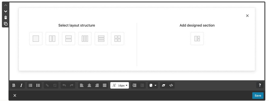
Click Add Section, choose a column layout, and start adding widgets.
2 Sections & columns
Sections are the top-level containers you stack vertically on the page. Each section holds one or more columns, and each column holds your widgets.
Column layouts
-
Up to 8 columns per section, each individually resizable by dragging the divider between them
-
Columns stack vertically on mobile automatically — no manual breakpoint setup
-
Each column can have its own background, padding, and border, independent of the section
-
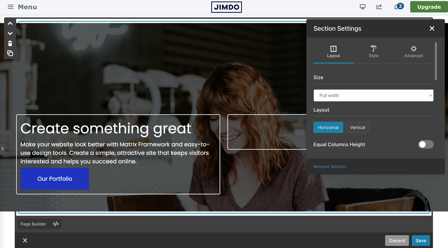
Equal Columns Height (Section → Layout tab) stretches every column to match the tallest one — great for card grids and pricing tables. It's automatically disabled below 768px so mobile keeps natural heights.
Section controls

3 Widget reference
Click the + button inside any column to open the widget toolbar, then pick a widget type. Every widget opens a popup with live-preview fields.
Create a styled heading, H1 through H6 — use proper hierarchy (H1 → H2 → H3) for SEO.
- Heading level selector (H1–H6)
- Text alignment: left, center, right
- Optional link on the whole heading
- Optional Font Awesome icon before or after the text — see Icons
A full TinyMCE rich-text editor for paragraphs and body content.
- Bold, italic, underline, and text alignment
- Link creation and management
- Bulleted and numbered lists
- Optional icon before or after the first paragraph
Upload or select an image, then fine-tune how it displays.
- Aspect ratio: Square, 16:9, 4:3, or Original
- Alignment: left, center, right
- Resize with +/- controls
- Alt text field for accessibility and SEO
A call-to-action link styled with the Style Editor's Buttons Advanced tab (Normal/Hover states, padding, radius, hover animation).
- Custom label text and destination URL
- Open in new tab option
- Alignment within the column
- Optional icon before or after the label
Drop in custom HTML/CSS/JavaScript with a syntax-highlighted code editor (CodeMirror) and a live preview.
- Great for embeds — maps, videos, third-party widgets
- Components Library button to insert reusable saved snippets
- Files Directory button to browse and insert uploaded media
Divider draws a horizontal line — styled by width, color, and line style. Spacer adds invisible vertical spacing with a custom height. Neither widget has an icon option.
- Divider: thickness, color, and line style (solid/dashed/dotted)
- Spacer: exact height in pixels, responsive per breakpoint
Embed a native Jimdo module — a contact form, shop product, gallery, map, video, or any other module already on your page — directly inside a Page Builder column. This isn't a reimplementation: Page Builder only handles the layout position, while Jimdo still owns the module's markup, scripts, and native editor.
How it works
Add the widget
Click + in a column → choose Jimdo Module.
Pick a module
Open the Page module dropdown and select an existing module on the page, shown as j-class · ID (e.g. j-formnew ·
12516316895).
Preview appears
The column shows a preview card: module type, "Live module on published page", and its ID — never the module's real content while editing.
Save
Saving the Text module persists only the link (the module ID) — not a copy of the module.
Two buttons on the preview card manage the link:
Admin vs. public
| Aspect | In the editor (admin) | On the published page |
|---|---|---|
| Native module position | Stays exactly where it already was on the page | Moved into the Page Builder column |
| What you see in the column | Preview card only | The real, live module |
| Editing the module | Still uses Jimdo's normal module editor | — |
This keeps Jimdo's own editor fully working — the live module is never detached from its expected place while you're editing, which avoids the breakage that comes from moving modules around mid-edit.
What can be embedded
Most content modules qualify: forms, shop products, image galleries, maps, video, call-to-action, download, social, blog selection, guestbook, tables, and more. A few things are intentionally excluded because Page Builder already has an equivalent, or because they can't be embedded inside themselves:
4 Toolbar-based editing
Click any widget, column, or section to select it — its toolbar appears with the actions available for that element. There's no drag-and-drop; every move is a deliberate click.
Widget toolbar
-
Move Up / Down reorders the widget within its own column
-
Move to Column transfers a widget to a different column — even in a different section
-
Copy duplicates the widget, including its icon settings and Advanced styling
-
The star () button opens icon settings on Heading, Text, and Button widgets only
5 Backgrounds & styling
Sections and columns each have an Advanced Settings panel for background, spacing, border, and shadow — accessed from their toolbar.
Background types
| Type | Options |
|---|---|
| Color | Theme colors (primary/secondary) or a custom hex, with 0–100% opacity |
| Gradient | Linear or radial, multiple color stops, adjustable opacity |
| Image | Upload, then position (center/cover/contain/repeat) |
| Image + Overlay | Image combined with a color or gradient overlay for text legibility |
Spacing, border & shadow
| Control | Details |
|---|---|
| Padding / margin | 4-side spacing, per-device (desktop/tablet/mobile), px / % / em / rem |
| Border | Type, per-side width, color, per-corner radius |
| Shadow | Outside or inset, with offset, blur, spread and color |
| Equal Columns Height | Section → Layout tab — stretch all columns to the tallest one (see Sections & columns) |
6 Animation & visibility
Entrance animations
Add a scroll-triggered entrance animation to any section or widget from its Advanced Settings.
Each animation has its own duration and delay controls, and plays once the element scrolls into view.
Device visibility
Every widget, column, and section has a Visibility control in its Advanced tab with three independent toggles:
In the admin editor, hidden elements get a dashed orange outline so you can still find and edit them — on the public site they're fully removed from that device's layout via CSS media queries.
7 Icons
Heading, Text, and Button widgets can each show a Font Awesome icon before or after their content. Click the star () button in the widget's toolbar to open icon settings. (Divider has no icon option — it's styled by width, color, and line style only.)
| What you type | Result |
|---|---|
heart or fa-heart
|
Solid heart icon |
brands instagram
|
Instagram brand icon |
fa-brands fa-facebook
|
Facebook brand icon |
regular heart or fa-regular fa-heart
|
Outline/regular heart icon |
Click the ? button next to the icon field to browse Font Awesome's full icon set, then copy the name back into the field. Every icon has four settings:
| Setting | Range |
|---|---|
| Position | Before / After the text (or None to remove it) |
| Size | 12px – 48px |
| Color | Any hex color |
| Spacing | 0px – 24px gap between icon and text |
8 Design Library
The Design Library gives you a head start with premade, ready-to-customize sections — browse by category and insert one with a single click.
Open the Design Library
Click the Design Library button in the Page Builder toolbar.
Filter by category
Use the category dropdown to narrow down the section grid, or browse "All".
Insert a section
Click a thumbnail — the section is inserted as a new section on your page, with colors already matched to your theme.
Customize
Edit content, images and styling with the usual toolbars — it's a normal Page Builder section from this point on.
-
Sections are fetched from a CDN and cached locally, so the library still works offline after the first load
-
Background colors are automatically recalculated to match your current theme colors when a section is inserted
-
Each inserted section gets a unique ID automatically, so adding the same template twice never causes conflicts
Troubleshooting
| Issue | Fix |
|---|---|
| Page Builder module missing from the module map |
Confirm features.pageBuilder = true is set and all four JS bundles are uploaded; check the console for errors.
|
| Widget toolbar doesn't appear when clicking | Click directly on the widget's content, check the console for errors, and reload the page. |
| Widget content disappears after editing | Allow pop-ups for your domain, and check for conflicting scripts in the console. |
| Backgrounds show in admin but not on the public page |
Confirm the restoration bundle is loading and clear your browser/CDN cache — public CSS is generated from data-pb-* attributes on load.
|
| Layout looks broken on mobile | Check for theme CSS conflicts and confirm you're not relying on Equal Columns Height on mobile — it's intentionally disabled below 768px. |
| Brand icon (e.g. Instagram) not showing |
Make sure the input is prefixed with brands, e.g. brands instagram — plain names default to solid icons.
|
| Design Library shows "No sections available" | Check your network connection to the CDN; the library falls back to a locally cached copy if the CDN request fails. |
| Jimdo Module dropdown is empty | The page needs at least one other eligible module (form, product, gallery, etc.) outside the Text module hosting Page Builder. |
| Jimdo Module preview shows but public page is empty | Confirm the Text module was saved after picking a module, and that the linked module still exists on the page. |
If you have encountered any bugs, errors, or unexpected behavior, please leave a comment below.