Style Editor
Customize colors, header, navigation, footer, and buttons visually — no coding required. Use quick Config Classes for one-click presets, or open the Advanced tab for pixel-level control over spacing, backgrounds, borders, shadows, button states, and decorative edge shapes.
Overview
The Style Editor is Matrix Framework's built-in visual customization tool. It lets you change colors, spacing, header/footer layout, navigation, and buttons directly on your live site preview — no CSS knowledge required.
-
Global & template colors, applied instantly across your whole site
-
One-click Config Class presets for header, navigation, footer, and buttons
-
An Advanced tab per section for exact padding, backgrounds, borders, shadows, and button states
-
Decorative edge shapes (waves, angles, slopes) between your header, hero, and footer
-
A dedicated Custom CSS field for anything beyond the visual controls
1 Accessing the Style Editor
The Style Editor lives in a floating toolbar at the top of your page while editing.
Hover the top of your page
Move your cursor to the very top of the page in the Jimdo admin.
Click the Style Editor icon
A toolbar appears — click the Style Editor icon to open the editor menu.
Pick a row
Choose a section — colors, header, navigation, footer, buttons, typography, or custom CSS.
Style, then Save
Use Config Classes and/or the Advanced tab, then click Save to publish your changes.
styleEditor: true,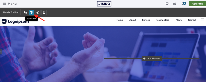

2 Config Classes vs. Advanced
Clicking most section rows opens a popup with two tabs:
| Tab | What it's for |
|---|---|
| Config Classes | One-click preset tags — fast styling for common patterns (e.g. sticky header, rounded buttons, dark footer). Always available. |
| Advanced | Fine-tuned controls for the same section — exact padding, backgrounds (color/gradient/image), borders, shadows, and (where relevant) button/link hover states. |
-
Both tabs can be used at the same time — Advanced settings take priority if they conflict with a Config Class.
-
A small green dot next to "Advanced" means this section already has saved Advanced styling.
-
Opening Advanced briefly highlights the matching area on your page, so you always know what you're editing.
-
Closing the popup without saving reverts any live preview changes.

3 Section reference
Every row in the Style Editor's main table, what it controls, and whether it has an Advanced tab.
Global colors set your brand palette, used everywhere as defaults:
Template colors override specific regions — set once, they cascade to every page:
Other quick color rows in the same table: Footer styles (background, text, link, horizontal line), Buttons (style 1–3, text color), Mobile navigation (background, nav color), and Other elements (social icons, top header / header / nav inner / footer borders).
Config Classes on this row control site-wide layout switches:
Advanced tab on this row is scoped to the logo and nav-parent behavior only:
- Logo padding — 4-side spacing around the logo
- Logo background — a solid color behind the logo, without shifting the image itself
- Logo position — Relative (default) or Absolute, with top/left offset sliders
- Disable parent links — makes top-level menu items with sub-pages non-clickable (they only open the dropdown)
The same row also has a Header bottom shape — see Decorative edge shapes.
These three rows share the same full container toolkit in their Advanced tab:
| Control | Details |
|---|---|
| Spacing | Padding and margin, 4 sides + unit (px / % / em / rem) + link-all toggle |
| Background | Color, linear gradient, radial gradient, or image |
| Border | Type, per-side width (linked), color, per-corner radius |
| Shadow | Outside or inset, with offset, blur, spread, and color |
Use these when Config Classes don't quite match your design — e.g. a custom gradient bar behind your navigation, or extra breathing room around your top header.
Config Classes: font size for breadcrumb text (e.g. size-15).
Advanced tab controls only the separator icon between breadcrumb items:
Config Classes: font size for the mobile drawer (e.g. size-30).
Advanced tab has three groups, in this order:
| Group | Details |
|---|---|
| Link color | Separate Normal and Hover tabs, each Custom color or Transparent. Automatically also styles the current page link and its parent menu item. |
| Hamburger menu | Line width (10–40px), thickness (1–5px), line color (theme colors), and background (default / theme / transparent). |
| Sub-menu toggle | The expand icon for dropdown items inside the mobile drawer: plus/minus (default), arrow, caret, or chevron. |
Config Classes: contact form appearance (form-white, form-dark, form-line, o-form).
Advanced tab is background only, applied to your entire main content area — color, linear/radial gradient, or an image with cover/pattern display and an optional overlay.
Config Classes: quick style presets (style 1–3) and text color.
Advanced tab is the most complete toolkit in the Style Editor — full Normal/Hover states, padding, corner radius, hover animation, and mobile full width. See the Buttons deep dive below for the full breakdown.
Heading levels H1–H4, body text (paragraphs, tables), and buttons all get their own row with class-based presets:
These rows are Config Classes only — typography doesn't have a separate Advanced tab since presets already cover size, weight, spacing, case, and font choice.
The Custom CSS row opens a full code editor for anything the visual controls don't cover. It also happens to be where the Style Editor stores itself:
- Every section's Advanced settings are written here inside marked comment blocks (e.g.
/* MATRIX-ADV-config1b-START */) — don't delete these blocks by hand, or that section's Advanced styling will be lost. - Your own custom rules can be added freely outside those blocks.
- Changes here apply to your entire website, not just one page.
5 Decorative edge shapes
Three areas of your site can get a decorative divider instead of a straight edge: the bottom of your header, the transition from hero to content, and the top of your footer. All three share the same seven shape profiles.
| Region | Where to set it | Applies to |
|---|---|---|
| Header bottom | Style Editor → Template configurations (Config Classes) |
#hs-container
|
| Hero → content |
Variable Module → Matrix Hero, requires draggable-hero
|
main.hs-content
|
| Footer top | Style Editor → Footer styles (Config Classes) |
.footer-options
|
Each shape has a matching size tag to scale its depth: br2, br5, br10, br15, br20, up to br500
for the most dramatic version. Only one shape and one size can be active at a time per region.
Style Editor vs. Global Settings
Matrix Framework has two site-wide customization tools — here's how they divide up:
| Tool | Controls |
|---|---|
| Style Editor | Colors, header/nav/footer sections, buttons, typography, decorative shapes — everything covered on this page. |
| Global Settings | Content width, special-pages content width, hero minimum height, font selection (typography families), and default image border radius. |
Restoring the color table
The Style Editor's color table lives in a Table module that can be removed from the popup — useful if you want to hide it, and easy to bring back.
Removing it from the popup
Click Remove in the Style Editor popup — the color table disappears from the popup and reappears as a normal Table module in your website's footer.
Putting it back into the popup
Open the table module
In the footer, click Edit HTML on the table module.
Add the class
Add color-switcher to the entire block, then click Save.
Wait a few seconds
The module disappears from the footer and reappears inside the popup.
Save in the popup
Click Save in the Style Editor popup to confirm it's restored.
If you deleted the table module entirely
Copy the default table code
Open the Matrix admin menu → Documentation → Matrix Style Editor, and click Copy.
Add a Table module
Add it to your footer — it no longer needs to sit inside Columns, unlike older Matrix themes.
Paste the code
Click Edit HTML and paste the copied code, replacing the default table content.
Confirm & save
The table should now appear inside the Style Editor popup. Click Save there to confirm.


Configuration
The Style Editor is on by default. Confirm it's enabled — or turn it off if you've finished customizing and want to lock the site's appearance.
window.MatrixConfig = {
  features: {
    styleEditor: true // Enable the Style Editor
  }
};
Troubleshooting
| Issue | Fix |
|---|---|
| Style Editor icon doesn't appear |
Confirm styleEditor: true is set in your configuration and the script is uploaded.
|
| Color table missing from the popup |
See Restoring the color table — either it was removed (add color-switcher back) or deleted (copy the default code from the admin menu).
|
| Advanced changes disappear after saving and reloading | Upload the latest framework bundle — this was a known save/reload timing issue that's since been fixed. |
| Advanced dot missing but styling still shows on the page | Reopen the section and click Save again on the Advanced tab to re-write the marker comment. |
| Advanced styling disappeared after switching templates | Reopen any section's Advanced tab once — Matrix automatically resyncs the saved CSS after a template change. |
| Button hover style looks different from Normal unexpectedly | Check both the Normal and Hover tabs — only properties you explicitly set on Hover override the Normal ones. |
| Edge shape not visible | Set a background color on that region first (e.g. Footer → Advanced → Background) — shapes need a color to paint with. |
If you have encountered any bugs, errors, or unexpected behavior in the Style Editor, please leave a comment below.
Support Team (Friday, 15 May 2026 19:22)
Hi Markus,
Please make sure you are using the correct code from Matrix One and that you are not mixing features or configuration options from two different products (the framework and Matrix One).
The installation guide provides a clear, step-by-step process for completing the setup. If you follow the guide carefully and in order, you should not encounter any issues during installation.
Markus Bischof (Friday, 15 May 2026 18:25)
The styleeditor don't function