Matrix Variables
Insert ready-made styling tags into any HTML/Widget module with a click — rounded images, spacing, hero effects, animations, and 100+ more. No CSS, no coding, just click and insert.
Overview
Matrix Variables is an admin tool that lets you add pre-built styling tags directly inside any HTML/Widget module placed in a Matrix grid column — no CSS knowledge required. Instead of writing style rules, you click a button, pick a tag from a category, and it's inserted at your cursor position automatically.
-
100+ ready-made tags across 10 categories — colors, spacing, hero effects, animations, forms, images, and more
-
Works directly inside Jimdo's HTML/Widget module editor — no external tools
-
Safe for non-coders: you only insert tags, never raw CSS
-
Live preview — see the effect immediately after saving the module
How it works
Matrix scans your page for HTML modules inside grid columns and adds the Variables button automatically — nothing to configure per module.
| Step | What happens |
|---|---|
| Module detection |
Matrix scans for .cc-m-htmlcode modules on the page.
|
| Column check |
Confirms the module sits inside a Matrix grid column (.cc-m-hgrid-column).
|
| Button injection | Adds a Matrix Variables button to that module's editor toolbar. |
| Live updates | A page observer keeps the button in sync as you add or remove modules — no page reload needed. |
1 Quick setup
Matrix Variables is enabled by default. If you've turned it off, or want to confirm it's active, check your configuration.
window.MatrixConfig = {
  features: {
    variableModule: true // Enable Matrix Variables
  }
};2 Opening the popup
Follow these steps in the Jimdo admin to insert your first Matrix Variable.
Add an HTML/Widget module
Insert an HTML/Widget module inside a Matrix grid column.
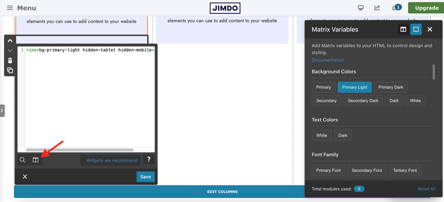
Click the Matrix Variables button
It's the columns-icon button in the module's toolbar, next to Widgets and Helper Classes.
Choose a category, then a tag
Browse a category and click a tag — it's inserted at your cursor position instantly.
Save & publish
Save the module and publish your page to see the new styling live.
What you'll find in the popup
-
A Grid / Column toggle at the top (see Grid vs. column tags)
-
Category sections, each with clickable tag buttons
-
A live badge showing how many tags are currently used in this module
-
A Reset All button to clear every tag from the current module
3 Grid vs. column tags
Every tag is inserted as either a <var> or an <ins> element. The toggle at the top of the popup switches which one new clicks insert into.
| Tag | Scope | Use it for |
|---|---|---|
<var>
|
Grid-wide | Styling that should apply to the whole Matrix grid / section this module belongs to. |
<ins>
|
Column-specific | Styling that should apply only to the current column, leaving sibling columns untouched. |

Selection logic
Matrix Variables applies smart rules per category so you can't accidentally create conflicting styles.
| Category | Rule |
|---|---|
| Background / Text colors, Border radius, Padding, Margin, Contact form styles | Single-select — picking a new tag replaces the previous one. |
| Matrix Hero → Hero options | Multi-select — combine freely, except overlay tags which are mutually exclusive. |
| Layout utilities | Multi-select — most combine freely (mobile spacers and outline buttons are mutually exclusive within their own group). |
| Animations | Single-select — only one Motion One animation at a time. |
| Image styling | Single-select per subsection (radius, border color, border width, aspect ratio, filters, effects). |
4 Variable reference
All 10 categories, grouped the same way they appear in the popup. Click a category below to jump straight to it, or expand each one for the full tag list.
Single-select — applies a solid brand background color to the module.
Single-select — sets the text color for content inside the module.
Single-select — rounds the module's corners.
Single-select — controls inner spacing on all sides.
Single-select — controls outer spacing around the module.
Hero options (multi-select, overlay tags mutually exclusive)
Shape (bottom edge) — single-select, requires draggable-hero
Hero shape size — single-select
The shape divider decorates the bottom edge of the hero and needs draggable-hero active first.
Single-select — plays a Motion One entrance animation once the module scrolls into view.
General
Mobile spacers (mutually exclusive)
Button styles (mutually exclusive)
Form styles
Single-select — restyles Jimdo contact forms without touching the module's own settings.
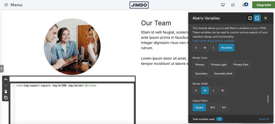
Border radius
Border color
Border width
Border style
Aspect ratio
Filters
Hover effects
Single-select per subsection — combine one radius + one border + one aspect ratio + one filter/effect freely.
Visibility classes
The Visibility Classes module provides responsive element visibility control for Jimdo websites. It allows you to hide elements on specific devices (desktop, tablet, mobile) while still showing visual feedback in admin mode.
Unlike the older Matrix theme classes (e.g.,hide-mobile,hide-desktop), which rely on media queries to hide or display elements at different device sizes, these classes actually remove elements from the DOM. This makes them especially useful for hiding and removing large gallery files or other heavy elements directly from the DOM.

Common combinations
Tags combine inside the same <var> or <ins> tag, separated by spaces. A few combinations that come up often:
Hero section with a shape divider
<var>draggable-hero color-white has-primary-overlay</var>Fullscreen hero with scroll arrow
<var> draggable-hero has-fullscreen-hero has-primary-overlay color-white has-btm-arrow</var>Animated card
<var>bg-white br15 add-15 motion-fadeInUp</var>Styled image
<var>img:br15 img:border-2 img:bg-primary img:effect-shadow</var>Styled contact form
<var>form-white </var>5 Advanced tab
Next to the tag categories, the popup has an Advanced tab for fine control over the current module's box model — without leaving the popup or writing CSS.
Fine-tune without touching CSS
Padding, margin, background, borders, corner radius, box shadow, and a full-width toggle — all from sliders and color pickers.
| Group | Controls |
|---|---|
| Padding / Margin |
Top / right / bottom / left, a link toggle to move all four together, and a unit selector (px, %, em, rem).
|
| Background | None, solid color, linear gradient, radial gradient, or an image (cover or repeating pattern, with an optional overlay). |
| Full width | Bleeds the module edge-to-edge (Page Builder–style), while its content stays within the normal container width. |
| Border | Type, per-side width with a link toggle, color, and per-corner radius. |
| Box shadow | Outside, inset, or none — with X/Y offset, blur, spread, and color. |
Click Save in the Advanced tab to persist your changes to the module. The button shows inline feedback (Saved / Save failed / Nothing to save) so you always know the result.

Configuration
Matrix Variables is on by default. If you're certain you won't use it, you can turn it off entirely.
window.MatrixConfig = {
  features: {
    variableModule: false // Disable the Matrix Variables popup
  }
};
Troubleshooting
| Issue | Fix |
|---|---|
| Matrix Variables button not appearing |
Confirm the module is a HTML/Widget module placed inside a Matrix grid column, and that variableModule is enabled.
|
| Hero shape not visible |
Include draggable-hero in the tag, upload the latest CSS/JS bundle, and hard-refresh the page.
|
| Advanced styles disappear right after Save |
Upload the latest variable-module.matrix.js and matrix.js — this was fixed with inline apply + a module cache.
|
| Copied module looks right in admin but not on the live page | Open the copied module once in the admin (auto-repair runs) or hit Save on the Advanced tab, then publish. |
| Variables not applying at all | Double-check the tag type toggle (Grid vs. Column) and that the tag wasn't accidentally edited by hand. |
| Performance issues with many modules on one page | Matrix automatically caps processing at 100 modules per page to stay fast — split very long pages if you hit this. |
If you have encountered any bugs, errors, or unexpected behavior in the Matrix Variables, please leave a comment below.