-
Style Editor
01
-
Navigation
02
-
Top Header Section
03
-
Multilingual templates
04
-
Google Fonts
05
-
Vertical line
06
-
Pre-made designs
07
-
FAQs
08

Introducing the New Style Editor and All-New Features of Matrix Themes.
I'm excited to announce the release of the new version of the Style Editor for Matrix Themes, which now offers more flexibility and customization for your website. In addition to this, you'll also find other new features that have recently been added to Matrix Themes.
Table of contents
01. Style Editor

The Style Editor includes two parts: table code and JS code, which, in the latest version, can now conveniently be found in the "Design Library" section of the Matrix Themes admin menu. You can easily switch from one design to another, with all the necessary source code available in one place.
As the Design Library includes previous versions of both the template and Style Editor, it is essential to use the corresponding JS code and template design for your website. Mixing different versions of the Style Editor with templates from other versions is not supported and may lead to compatibility issues.
What's new?
The new Style Editor offers enhanced customization options for templates, providing more advanced features. For instance, the header section includes various containers with different elements that can be tailored using custom colors and additional CSS classes. This flexibility allows you to create a unique, personalized design for your website.
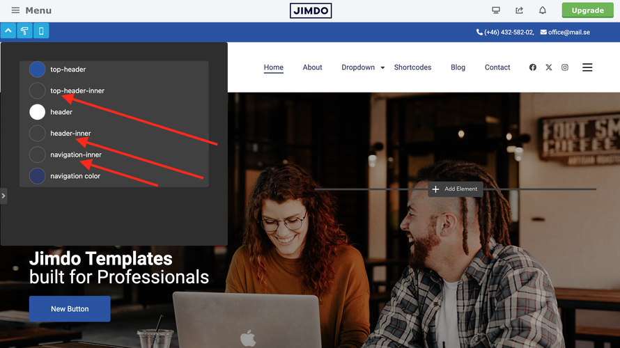
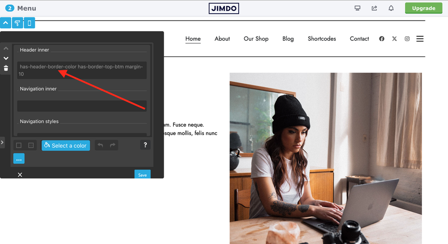
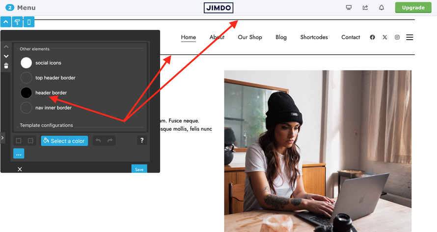
| has-top-header-border-color | Adds border to top-header section |
| has-header-border-color | Adds border to header section |
| has-nav-inner-border-color | Adds border to nav inner section |
| has-border-top | Adds top border |
| has-border-right | Adds right border |
| has-border-btm | Adds bottom border |
| has-border-left | Adds left border |
| has-border-left-right | Adds left and right border |
| has-border-top-btm | Adds top and bottom border |
| has-thin-border | 1px solid border |
| has-medium-border | 2px solid border |
| has-large-border | 3px solid border |
| has-extra-large-border | 5px solid border |
Background image for footer
In the new Style Editor, you can now add a background image to the footer. To do this, upload the image to your file folder (Design > Custom Template > File), copy the image URL, and insert it into the Style Editor. You can choose between a cover image or a repeated pattern. To ensure the image is visible, adjust the opacity of the background color accordingly.


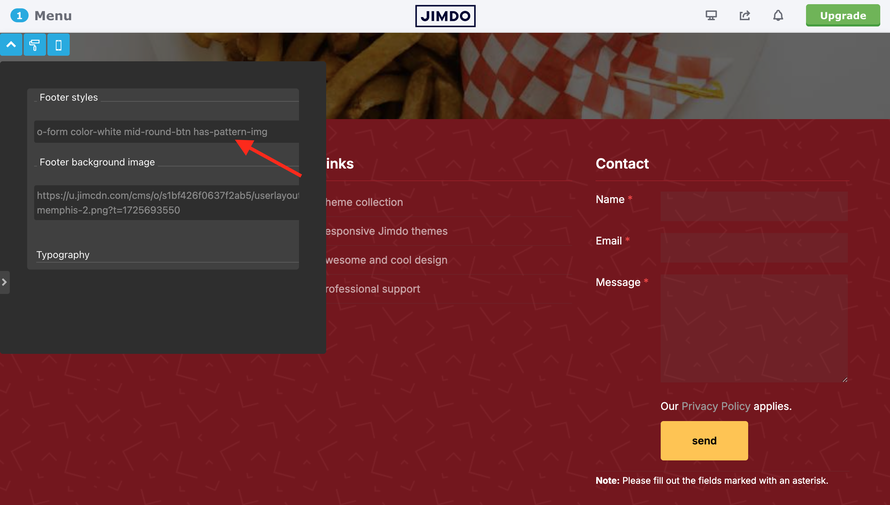
In the last screenshot, you can see that to use a pattern image, you need to add the custom class 'has-pattern-img'.
A good resource for finding pattern images is https://pattern.monster/. It is recommended to use PNG format with dimensions of 500px by 500px to avoid large image sizes.
- has-pattern-img - pattern repeated image
02. Navigation
Previously, you could customize your navigation with various animated underline effects or simple color settings. The new Matrix Themes now offer the ability to apply a background color to the main menu, including dropdown navigation, allowing you to further customize its appearance.
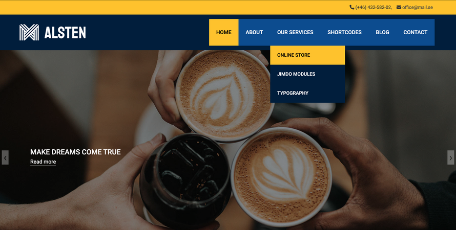
Let's see how it works
It’s all about adding the correct custom class in the Style Editor for the navigation field.
Case 1: default animated and thin line

By adding the snip-nav class, all navigation levels will share the same style.
- snip-nav --line01 line-height:1px;
- snip-nav --line02 line-height:2px;
- snip-nav --line03 line-height:3px;
- snip-nav --line04 line-height:4px;
- snip-nav --line05 line-height:5px;
Case 2: Simple Active and Hover Color Styles
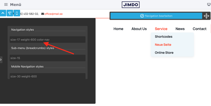
- primary-color-nav
- secondary-color-nav
Case 3: Color Underlined Style
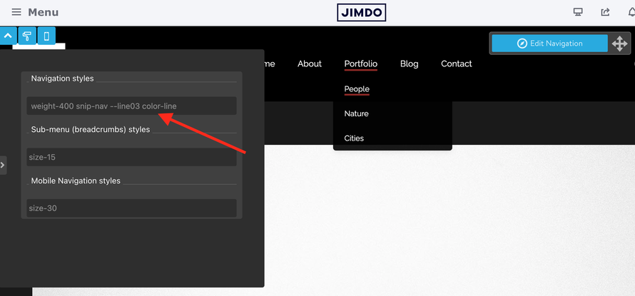
The updated CSS provides two color styles: primary and secondary
- snip-nav primary-color-line
- snip-nav secondary-color-line
Case 4: background color for the main and dropdown menu.
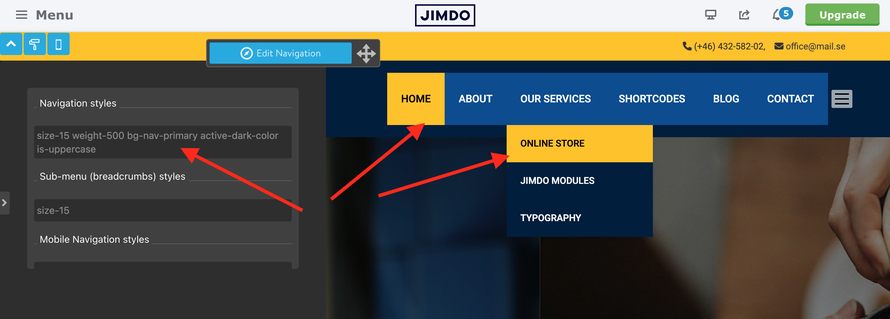
The classes bg-nav-primary and bg-nav-secondary use the same colors as .bg-primary and .bg-secondary, which are configured in the Style Editor.
| bg-nav-primary active-dark-color |
- bg-nav-primary
- bg-nav-secondary
- active-dark-color
- active-white-color
Case 5: Keep the default main navigation and customize only the dropdown menu

| bg-subnav-primary white-subnav-color |
With numerous color scheme combinations available, you can easily customize the design to match your preferences and adapt the colors to your brand's palette.
- bg-subnav-primary
- bg-subnav-secondary
- white-subnav-color
- dark-subnav-color
03. Top Header Section
All Matrix themes provide an option to add a top header section above the main header, which can include contact information and other content. The methods for achieving this vary depending on the version of the theme you are using in your template.
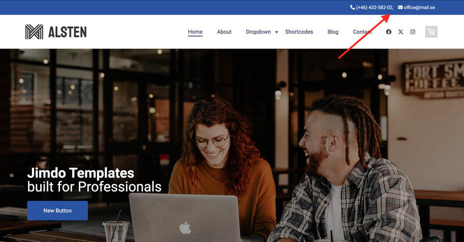
How it works in the latest version of the Matrix theme
1. In the Footer (or sidebar), add a new module by selecting Widget/HTML.
2. Insert the following code into the widget:
<div class="draggable-top-header add-10 color-white link-white size-13">

<div class="fa fa-phone">
    </div>
    (+46) 432‑582-02,
    <div class="fa fa-envelope add-left-10">
    </div>
    <a href="mailto:[email protected]">[email protected]</a>

</div>
<div class="matrix-msg invisible">
    Edit Top Header section here
</div>
3. After adding the code, click the "Apply Styles" button in the style editor or simply refresh the page.
Upon refreshing, the content of your widget should now appear at the top of the header.
Even though this widget appears in the top header section, it works similarly to the header social links. You can still edit it in the Footer (or sidebar) from the same position where you originally added it. To edit the widget, simply hover your mouse over the editor module, and you'll be able to make changes.
You can use helper classes like color-white, link-white, right-align, size-13, etc., directly within the widget code or in the style editor to customize the appearance of the content.
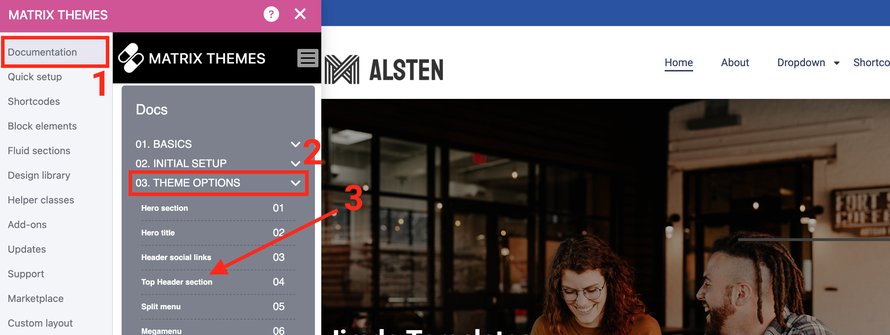
Documentation
The complete documentation for the top header section can be found under
Documentation > Theme Options > Top Header Section
04. Multilingual templates
The multilingual Matrix themes have also been updated, introducing a few changes:
- Only standard Jimdo navigation (no dropdown) is now supported. After the previous release of multilingual themes with dropdown menus, some users encountered difficulties managing the navigation structure, which was based on page URLs and required a new installation.
- The new multilingual templates offer a more flexible language selection option (first-level navigation), which can now be displayed in various positions within the template, including the top header section, header, or footer

The latest multilingual Matrix themes don’t automatically display the first level, so you’ll need to add it manually using the Widget/HTML module in the footer section.
There are two options for displaying the language selector, depending on where you prefer it to appear:
1. Display the language selector in the top header section:
<div class="draggable-top-header">
    <div class="has-lang-nav has-divider">
    </div>
</div>
<div class="matrix-msg invisible">
    Display language menu
</div>
2. Display the language selector inside the header:
<div class="hs-magic hide-mobile">
    <div class="has-lang-nav snip-nav is--inline-block bg-primary br500 color-white --line03">
    </div>
</div>
<div class="matrix-msg invisible">
    Display language menu
</div>
As you can see from the code, there are various helper classes available to customize the style of the language selector widget. You can always edit the widget in the footer where it was placed, and after reloading the page, you’ll see the changes reflected in the desired section.
The complete documentation for the multilingual templates can be found under
Documentation > Theme Options > Multilingual themes
05. Google fonts
Google Fonts in Matrix Themes now utilize CSS variables. In the Quick Setup > Google Fonts section, you will find the updated code to add under Settings > Edit Head.
<link href="https://fonts.jimstatic.com/css?family=Poppins:400,500,600,700,800" rel="stylesheet" type="text/css"/>

<style>
/* <![CDATA[ */
:root {
--primary-font: 'Poppins', sans-serif;
}

/*]]>*/
</style>
To apply the Google Font site-wide, the g-font class should be added to the "Template Configurations" field in the Style Editor. If you want to apply the custom font to specific elements only, the g-font class should be added to the corresponding section within the Style Editor.
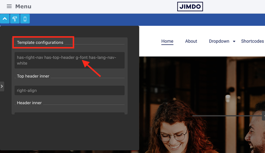

Another option is to use Google Fonts through the Font Settings in your Jimdo account. If you remove all g-font classes from the Style Editor, your website will automatically use the typography styles configured in Font Settings.

Please note that this option has several limitations: you cannot select a font specifically for the navigation, and the Jimdo system does not provide additional styling options like font-weight, text-transform, or letter spacing.
06. Vertical line
A vertical line can be used to divide content with a border. This can be achieved within the columns module by adding a right border.
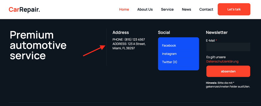
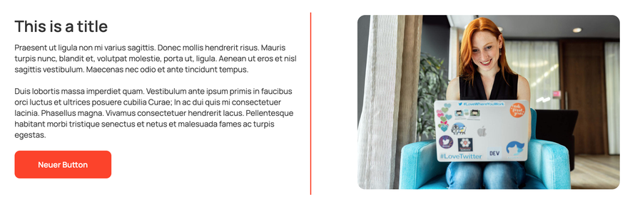
Simply add a Widget/HTML element inside the column where you want the right border to appear. Inside the Widget/HTML module, use the following classes within the <ins> tag:
<ins>has-right-col-border</ins>
Below are the helper classes for additional customization:
- has-primary-border
- has-secondary-border
- has-thin-border
- has-medium-border
- has-large-border
07. Pre-made designs
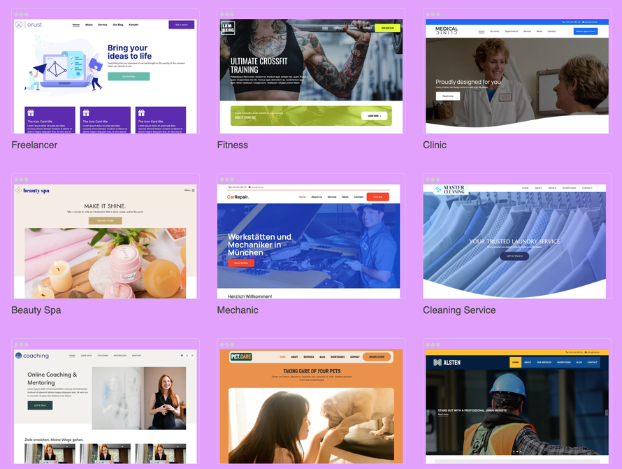
The new Style Editor and additional tools in Matrix Themes offer extensive customization options. The pre-made designs, now located on a separate page, provide inspiration and showcase the full potential of customization. With these tools, you can create a completely unique and fully customizable design.
08. FAQs
How to Update a Matrix Theme with the Latest Release
If you're using a Matrix theme installed after 2022 with the Style Editor, follow these steps to update it:
- Download the Files: In the Matrix Themes admin menu, navigate to the "Updates" section and download all the CSS components and JS file to your computer.
- Upload the Files: Go to Design > Custom Templates > Files on your website, and upload the files you just downloaded.
- Update Source Files: In the "Updates" section, you will also find the source files (HTML and CSS). Use the copy button to copy the updated code and paste it into Design > Custom Template > HTML (CSS) for both the HTML and CSS. Don’t forget to save the changes.
- Update the Style Editor: In the "Design Library" section, select a template and paste the code into the corresponding sections of the Style Editor's tables.
- Update the JS Code: The second part of the Style Editor code, which includes the JS, should be replaced in the Widget/HTML section. You can find this JS code in the "Design Library" for easy access.
The Style Editor Isn't Working Correctly?
Ensure you have installed the correct and latest version of the Style Editor. In the "Design Library," you will find both the latest release and the previous version. Keep in mind that mixing different versions of the Style Editor is not supported.
Here are the most common issues to check:
- The latest Style Editor only works with the most recent versions of HTML and CSS.
- Some CSS file components may not have been updated.
- The JS file may not have been updated.
Make sure all necessary updates are applied to ensure proper functionality
Any other question? Add a comment below!
Write a comment